

Your QA dashboard is probably lying to you. Not through bad data, but through the wrong questions: high pass rates on stale test suites, climbing test case counts with no signal, and coverage percentages that say 80% while critical bugs reach production every sprint.
The QA metrics that matter for engineering teams are not the ones that make QA look productive. They are the ones that predict failures, expose bottlenecks, and tell you whether your testing process is actually protecting the product.
TL;DR
- Most QA dashboards track volume and activity, not risk and outcomes. That distinction costs engineering teams real money.
- Four common metrics actively mislead: test case count, pass rate on unchanged suites, raw bug count, and coverage percentage without risk weighting.
- A metric earns dashboard space only if it changes a decision a VP Engineering or QA Director would otherwise make differently.
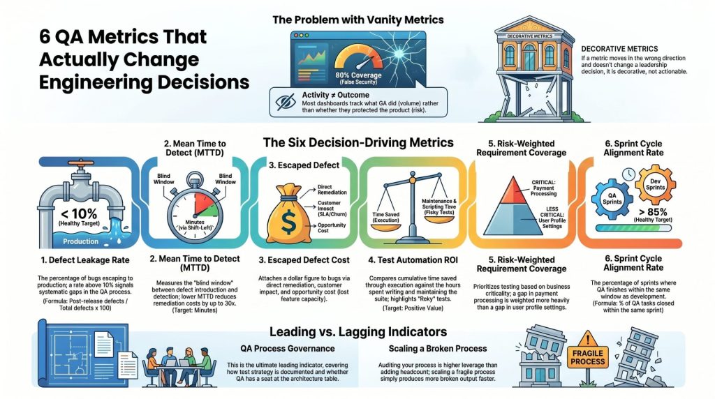
- Six metrics do earn that space: Defect Leakage Rate, Mean Time to Detect, Escaped Defect Cost, Test Automation ROI, Risk-Weighted Requirement Coverage, and Sprint Cycle Alignment Rate.
- QA process governance is a leading indicator, not an afterthought. Teams that audit their own QA process before a failure catch structural gaps that no single metric will surface.
Most QA Dashboards Are Measuring the Wrong Things
Ask a QA team to justify their work and they will almost always reach for the same numbers: tests run, bugs filed, pass rate, coverage. These numbers are visible, easy to collect, and look credible in a slide deck. They are also largely useless for predicting whether a release will hurt your users.
Most QA metrics measure activity rather than outcomes. Activity metrics tell you what the QA team did. Outcome metrics tell you whether what they did protected the product. Engineering leaders rarely push back on that distinction until a critical bug escapes to production and they realize their dashboard gave them no warning at all.
This is not a tooling problem. Teams running Test Automation & CI/CD in sophisticated pipelines make the same mistake as teams running entirely manual regression. Metric selection is a strategy decision, not an engineering one.
Four Metrics That Look Useful and Quietly Mislead You
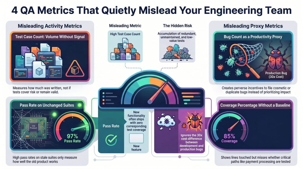
Test Case Count: Volume Without Signal
A QA library of 4,000 test cases is not inherently better than one of 400. It may actually be worse, because large, unmaintained suites accumulate redundant, outdated, and low-value tests that consume execution time without improving coverage where it counts.
Test case count tells you how much the team has written. It says nothing about whether those tests cover the right functionality, whether they are still valid against the current codebase, or whether they would catch the failure mode that caused your last production incident. Teams that reward case count creation end up optimizing for the metric, not for quality.
Pass Rate When the Suite Has Not Changed
A 97% pass rate sounds excellent. It means almost nothing if the test suite has not been updated since the last major feature release.
When new functionality ships without corresponding test coverage, the existing suite continues to pass because it is not testing anything new. Pass rate, in that context, measures how well the old product still works. It tells you nothing about the reliability of the thing users are actually touching. Watch for pass rate trending upward alongside a declining rate of test suite updates. That combination is a red flag, not a green light.
Bug Count as a Productivity Proxy
High bug counts are often cited as evidence that QA is doing its job. The logic is intuitive: more bugs found means better testing. But bug count as a standalone metric creates perverse incentives.
Teams measured on bugs filed will file more bugs, including duplicates, edge cases with minimal user impact, and cosmetic issues that crowd out meaningful prioritization. Raw bug count also does not distinguish between a bug caught in a unit test at commit time and a bug caught by a customer after launch. Those two bugs carry radically different costs, and a metric that treats them identically is noise, not a quality signal.
Test Coverage Percentage With No Baseline
Code coverage tools report what percentage of the codebase is exercised by the test suite. Most engineering teams target a number, often 80%, and treat reaching it as a quality milestone. Without context, that number is nearly meaningless.
Coverage percentage tells you which lines of code were touched during test execution. It does not tell you whether the tests are asserting the right behavior, whether critical paths are proportionally covered, or whether the untested 20% contains your most failure-prone logic. A suite can achieve 85% coverage while leaving payment processing, authentication, and data persistence logic largely untested. The percentage looked fine. The release did not.
What a Metric Actually Has to Do to Earn a Spot on Your Dashboard
Before adding anything to a QA dashboard, apply one test: if this metric moved significantly in the wrong direction next sprint, would it change a decision a VP Engineering or QA Director would otherwise make differently?
If the answer is no, the metric is decorative. Interesting, maybe. Not actionable.
Metrics that earn dashboard space share three properties:
- Predictive value: They signal a problem before it reaches production, not after.
- Decision linkage: A change in the number maps directly to a specific action, whether that is expanding test coverage, rebuilding a flaky suite, adjusting sprint structure, or escalating a governance issue.
- Resistance to gaming: The metric is hard to improve without actually improving quality. Pass rate is easy to game. Defect leakage rate is not.
Every metric in the next section passes all three tests.
Six QA Metrics That Change Engineering Decisions
Defect Leakage Rate: The Only Bug Metric That Tells You Whether QA Is Working
Defect leakage rate measures the percentage of bugs that escape QA and reach production relative to the total number of defects found across the entire cycle, including those caught in QA.
The formula is straightforward: divide post-release defects by the total defects found (pre-release plus post-release), then multiply by 100.
A leakage rate above 10% signals that your QA process has systematic gaps. Above 20%, QA is not functioning as a quality gate; it is functioning as a partial filter. When the Fortune 500 e-commerce client Outpost QA worked with had developers testing their own code across 20-plus concurrent projects, defect leakage was one of the clearest indicators that the model was broken. Once a dedicated QA pod was in place, the team caught 30-plus high-impact bugs before GA, dropping the leakage rate significantly within the first release cycle.
This is the metric that tells you whether QA is working. Everything else is context.
Mean Time to Detect (MTTD): How Long Your Pipeline Is Blind
Mean Time to Detect measures the average time between when a defect is introduced into the codebase and when QA or automated testing identifies it.
Long MTTD values mean your pipeline has a blind window. A bug introduced on Monday that is not caught until Friday’s regression run has five days to compound. Other features may have been built on top of it. Dependent systems may have been tested against broken behavior. By detection, the remediation cost is far higher than it would have been at commit time.
Reducing MTTD is the primary engineering argument for shift-left testing. When tests run at the pull request level rather than at the end of the sprint, MTTD collapses from days to minutes. NIST research on the cost of software defects puts the cost of fixing a production bug at roughly 30 times what it costs to fix one found during development. MTTD is the metric that shows you how early or late your pipeline is catching problems.
Escaped Defect Cost: Attaching a Dollar Figure to Missed Bugs
Most engineering teams track bugs by severity. Few attach an actual cost to the ones that escape. Escaped Defect Cost closes that gap by estimating the financial impact of post-release defects across three dimensions:
- Direct remediation cost: Engineering time to diagnose, fix, and re-deploy.
- Customer impact cost: Support volume, churn risk, and SLA penalties where applicable.
- Opportunity cost: Sprint capacity consumed by firefighting rather than feature delivery.
This metric matters most in executive conversations. When a QA Director requests headcount or tooling investment, the request lands differently when it is attached to a number that says “our last three production incidents cost an estimated $180,000 in remediation and pulled two senior engineers off roadmap work for six days.” Escaped Defect Cost converts QA from a cost center argument into a risk management argument.
In regulated industries, the calculation also includes potential compliance exposure. When Owlet was shipping firmware updates for life-critical infant monitors, the escaped defect cost of a missed synchronization failure was not just engineering time. Outpost QA’s work intercepted 400-plus critical bugs before production and achieved zero regulatory findings on Medical Application Verification Reports. The financial and reputational value of that outcome dwarfs the cost of the QA engagement.
Test Automation ROI: What Your Automated Suite Is Actually Returning
Test automation is frequently treated as a net positive by default. Build it once, run it forever. The reality is that automated suites carry ongoing maintenance costs, and those costs are rarely tracked against the value the suite generates.
Test Automation ROI compares the cumulative time saved through automated execution against the time invested in writing, maintaining, and debugging the automation itself. A suite that takes 40 engineer-hours per sprint to maintain but saves only 20 hours of manual regression execution is producing negative ROI. Teams discover this only when they actually do the calculation.
The metric also exposes flaky tests. A test that fails intermittently without a real defect present erodes trust in the entire suite. Engineers begin ignoring red builds. The automation exists, but the signal it was meant to generate is buried in noise. Tracking the flakiness rate of individual test cases, and removing or stabilizing tests that exceed a threshold, directly improves automation ROI.
Requirement Coverage With Risk Weighting: Where Gaps Are Most Dangerous
Standard coverage metrics treat every requirement equally. Risk-weighted requirement coverage applies a priority score to each functional area based on business criticality, historical defect density, and user impact, then measures coverage against that weighted map.
The practical effect is that a gap in payment processing shows up as a higher-severity coverage deficit than a gap in the user profile settings page, even if both represent the same number of untested requirements. Risk weighting forces the coverage conversation to happen in the right order.
This approach is especially valuable for QA Process Audits and Enterprise Governance engagements, where the audit team often finds that coverage looks acceptable in aggregate but is thin in the highest-risk areas. Dportenis, a retailer replacing a 20-year-old system, had no formal QA methodology and was using store employees as testers. When structured testing was introduced, the 450-plus bugs identified pre-launch were concentrated in exactly the areas risk weighting would have flagged first: payment processing and third-party integrations.
Sprint Cycle Alignment Rate: Whether QA Is a Bottleneck or a Teammate
Sprint Cycle Alignment Rate measures the percentage of sprints in which QA testing completes within the same sprint window as development, without work carrying over into the next cycle.
A low alignment rate is the clearest evidence that QA is a bottleneck rather than a parallel function. When development closes tickets on Friday and QA still has 40 unvalidated items, one of three things is happening: QA is under-resourced relative to development output, QA was not brought in early enough in the sprint to test incrementally, or the test suite requires full regression runs that do not fit the sprint timeline.
All three causes are solvable. None are visible if the team is only tracking bug counts and pass rates.
A healthy Sprint Cycle Alignment Rate, above 85% in most sprint-based teams, is a structural indicator that QA is integrated into the development process rather than appended to it.
The Metric Most Teams Skip: QA Process Governance as a Leading Indicator
Every metric discussed so far is a lagging indicator in some sense. Defect leakage rate tells you that bugs escaped. MTTD tells you that detection was slow. Even Sprint Cycle Alignment Rate tells you, after the sprint, whether QA kept pace.
QA process governance is what predicts all of them.
Governance covers the structures that determine whether good metrics are even possible: how test strategy is documented and updated, whether requirements are testable before development starts, how test debt is tracked and prioritized, and whether QA has a defined seat at the table during sprint planning and architecture review.
Teams with weak governance will produce unreliable metrics regardless of tooling. The numbers will shift, but the underlying process fragility will persist. Teams that audit their own QA process, formally and on a regular cadence, catch structural gaps before those gaps show up as production failures.
This is why a QA process audit is often the highest-leverage engagement an engineering leader can pursue before scaling QA resources. Scaling a broken process produces more broken output, faster.
When Your QA Metrics Are Fine but Bugs Still Reach Production
This scenario is more common than it should be. Defect leakage rate looks acceptable. Automation coverage is high. Sprint alignment is good. And then a critical bug reaches production.
Usually one of three things is happening:
- The test environment does not match production. Tests pass in staging against data sets and configurations that do not reflect real user behavior. Bugs exist only under production conditions.
- The automation suite is testing the wrong things. High coverage of low-risk paths combined with shallow coverage of complex user journeys can produce metrics that look healthy while leaving real exposure untested.
- Manual exploratory testing was cut too early. Automation is excellent at verifying known behavior. It is poor at discovering unknown failure modes. Teams that eliminate manual testing entirely to hit automation coverage targets lose the exploratory function that catches novel bugs.
The solution in each case is not a new metric. It is a process review that examines what the current metrics are not capturing. Good metrics tell you where to look. They do not replace the judgment required to look in the right places.
Three Signs Your Current Metrics Are Protecting the QA Team, Not the Product
This is the version of the conversation most engineering leaders have not had with their QA function. Metrics can be selected, consciously or not, to make QA look effective rather than to surface where QA is failing.
Watch for these patterns:
- Metrics trend positive after every sprint, without corresponding improvement in production stability. If pass rate, bug count, and coverage all improve quarter over quarter while your production incident rate stays flat, the metrics are measuring QA activity, not production risk.
- The QA team reports metrics that require interpretation to be meaningful, and that interpretation always favors QA. Bug counts that exclude “known issues” or “deferred defects.” Coverage percentages calculated against a subset of requirements. Pass rates that exclude flaky tests from the denominator. Each adjustment may have a legitimate technical justification. Collectively, they should raise questions.
- No metric directly links to a consequence the QA team does not control. If every metric on the dashboard measures something the QA team produces, rather than something users experience, the dashboard is an internal performance review, not a quality signal.
The shift from self-protective metrics to product-protective metrics is a leadership conversation. It requires a QA function willing to be measured against outcomes it cannot fully control, and engineering leadership that understands the difference.
If you want to know whether your current QA metrics would have caught your last production incident before it reached users, that question is worth answering now, not after the next one. Talk to a QA Architect at Outpost QA about auditing the metrics your team is tracking and building a dashboard that actually protects the product.
Frequently Asked Questions
What is defect leakage rate and why is it the most important QA metric?
Defect leakage rate measures the percentage of bugs that escape QA and reach production. It directly answers whether QA is functioning as a quality gate. A rate above 10% indicates systematic gaps in the testing process, and it cannot be improved without actually improving quality, which makes it resistant to the gaming that distorts metrics like pass rate or bug count.
How do you calculate Test Automation ROI?
Test Automation ROI compares the cumulative time saved through automated execution against the total time invested in writing, maintaining, and debugging the automation suite. If maintaining your suite costs more engineering hours per sprint than it saves in manual testing effort, the automation is producing negative ROI. Tracking flakiness rate alongside this calculation helps identify which tests are consuming maintenance time without generating reliable signal.
What is a healthy Sprint Cycle Alignment Rate?
For most sprint-based engineering teams, a Sprint Cycle Alignment Rate above 85% indicates that QA is operating as a parallel function rather than a bottleneck. Rates consistently below 70% signal that QA is under-resourced relative to development output, is being engaged too late in the sprint, or is running regression suites that do not fit the sprint timeline.
Why does test coverage percentage often give a false sense of security?
Coverage percentage measures which lines of code were executed during testing, not whether those lines were tested with meaningful assertions or whether the most critical paths received proportional attention. A suite can achieve 85% coverage while leaving payment processing and authentication logic largely untested. Risk-weighted requirement coverage is a more reliable alternative because it forces coverage gaps to be prioritized by business impact.
How can engineering leaders tell if their QA metrics are protecting QA rather than the product?
Three patterns indicate that metrics have been selected to reflect favorably on QA rather than to surface product risk: metrics trending positive while production incident rates stay flat, metrics calculated against subsets that exclude inconvenient data, and dashboards where every metric measures QA output rather than user-facing outcomes. The corrective step is to require that at least one primary metric connects directly to post-release behavior that the QA team does not control.